Gå til innhold
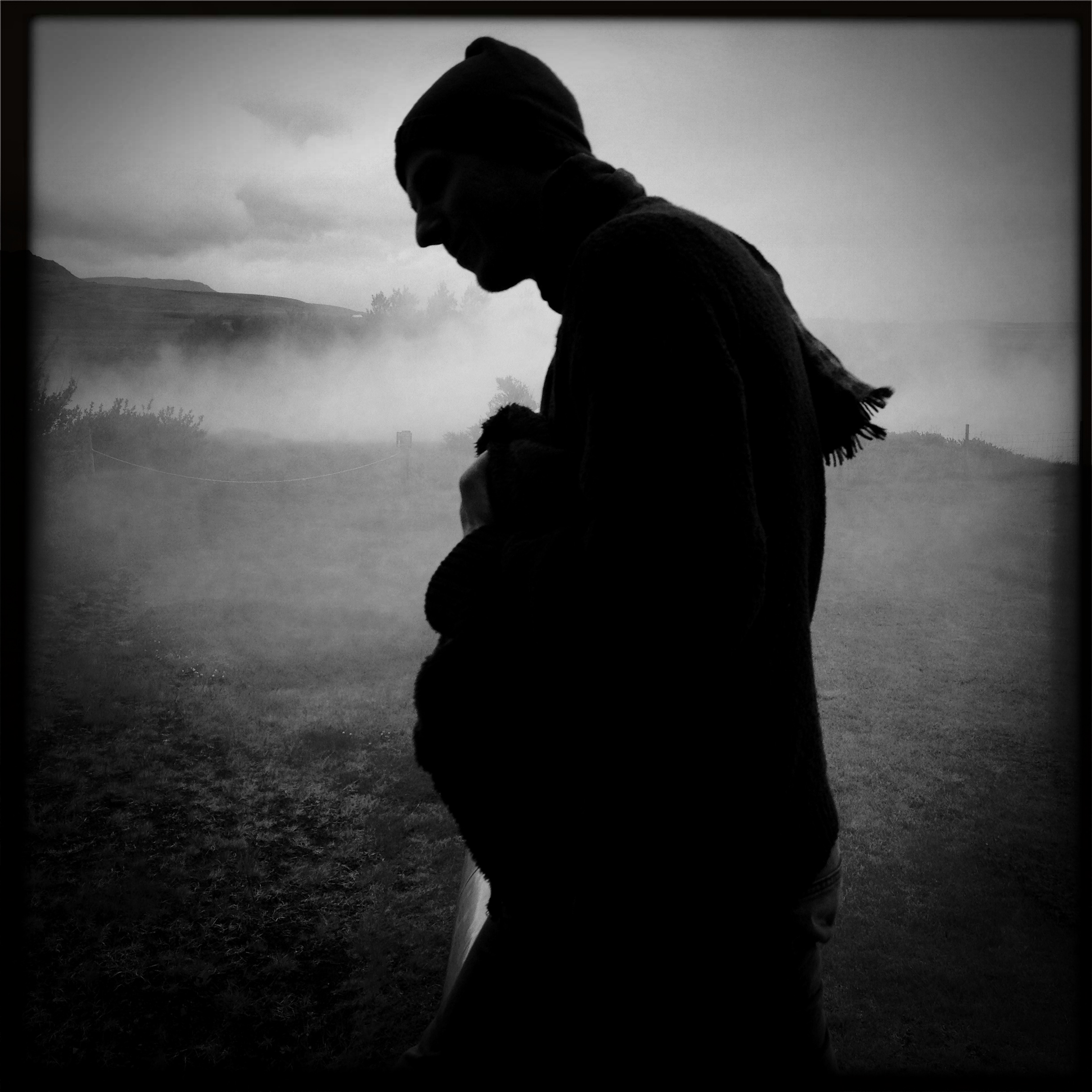
 «Airborn»
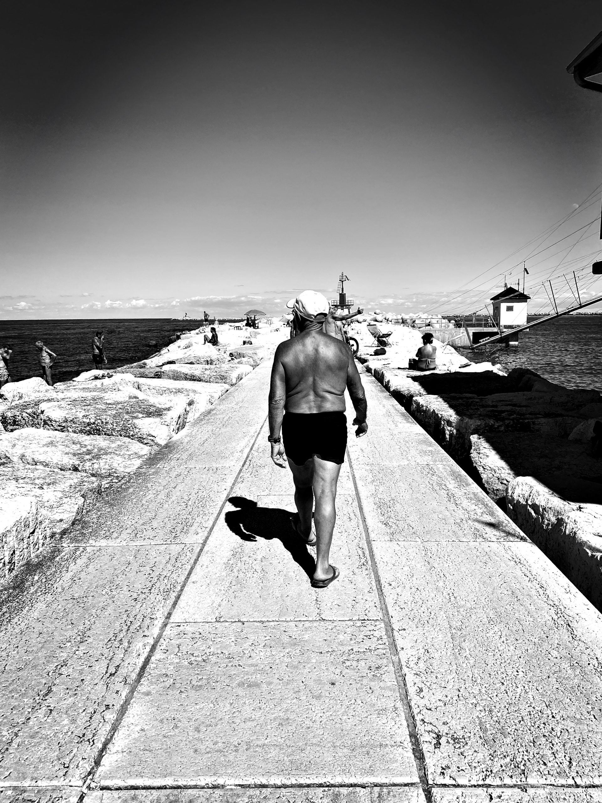
Light and shadow
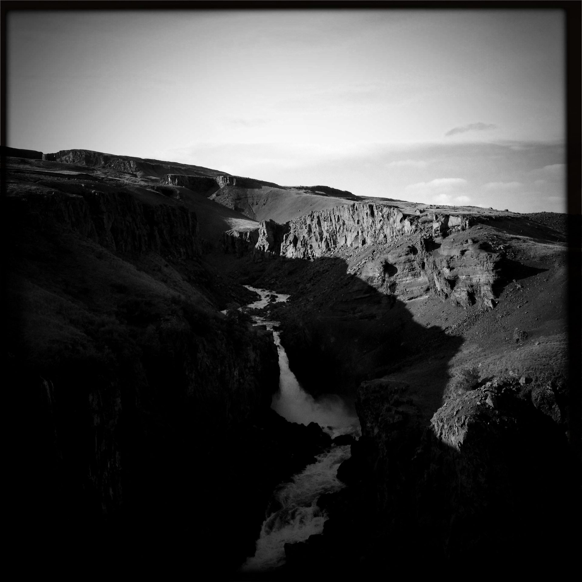 Hengifóss, Iceland
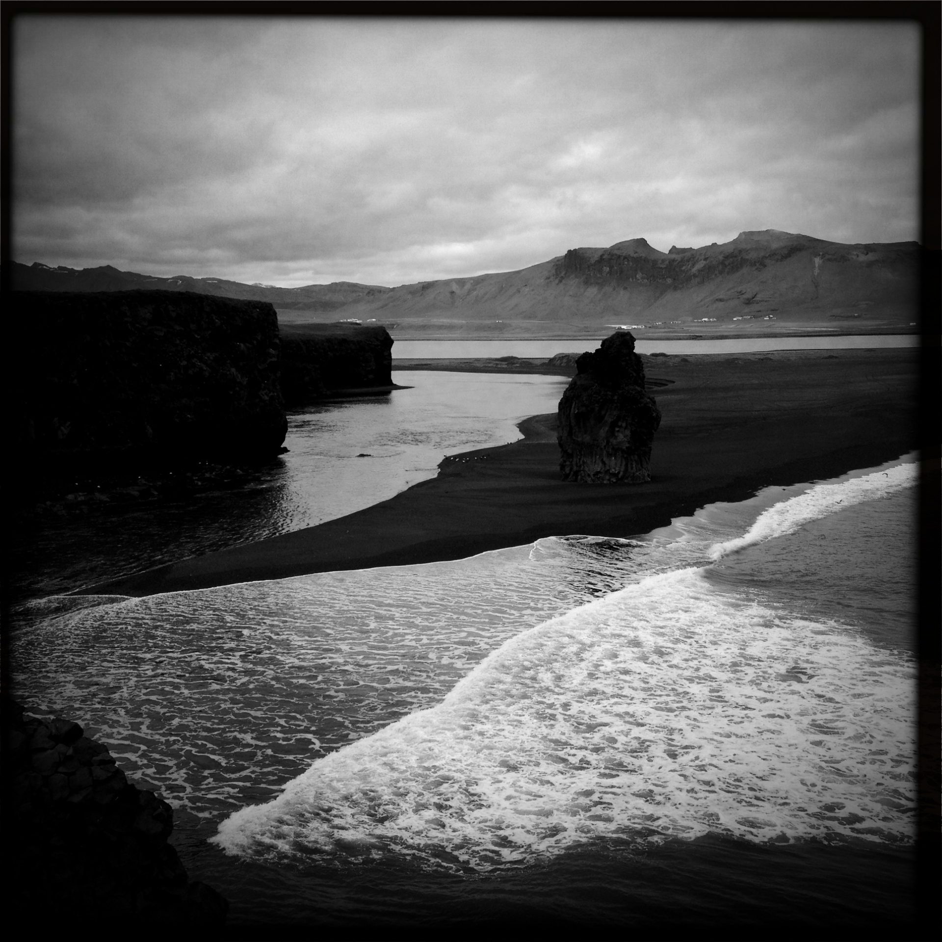
 Batman, Iceland
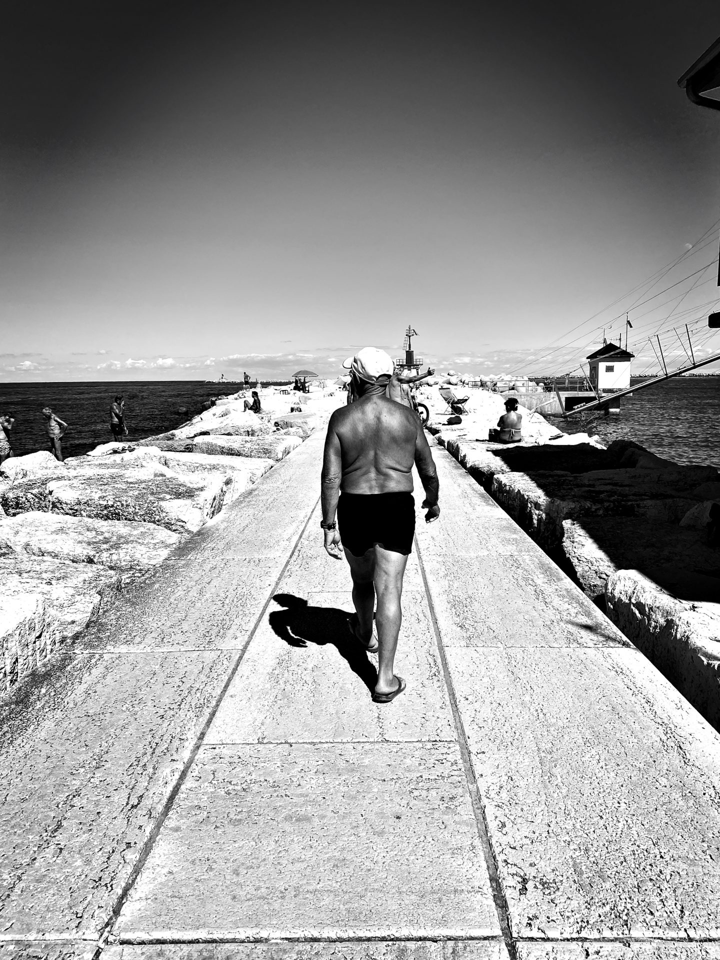
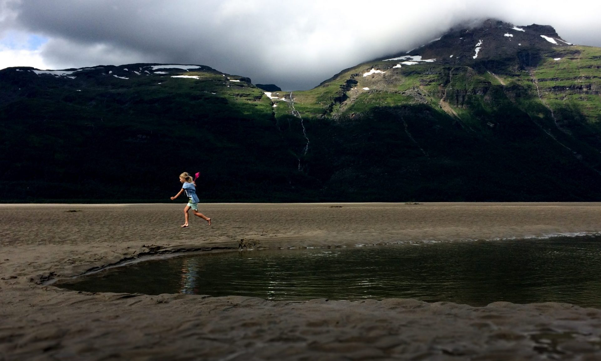
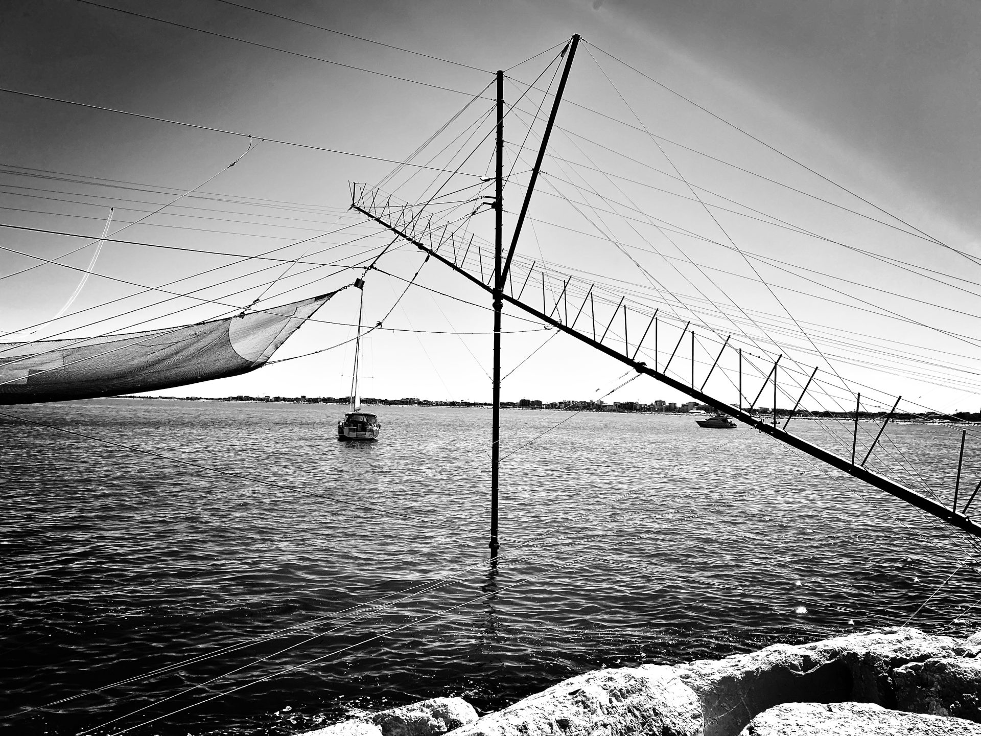
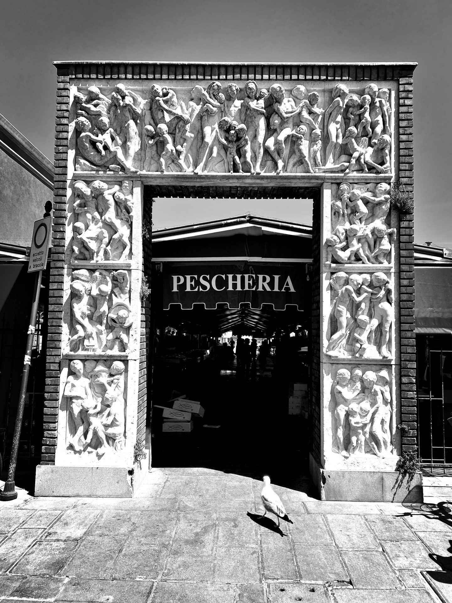 Entering paradise
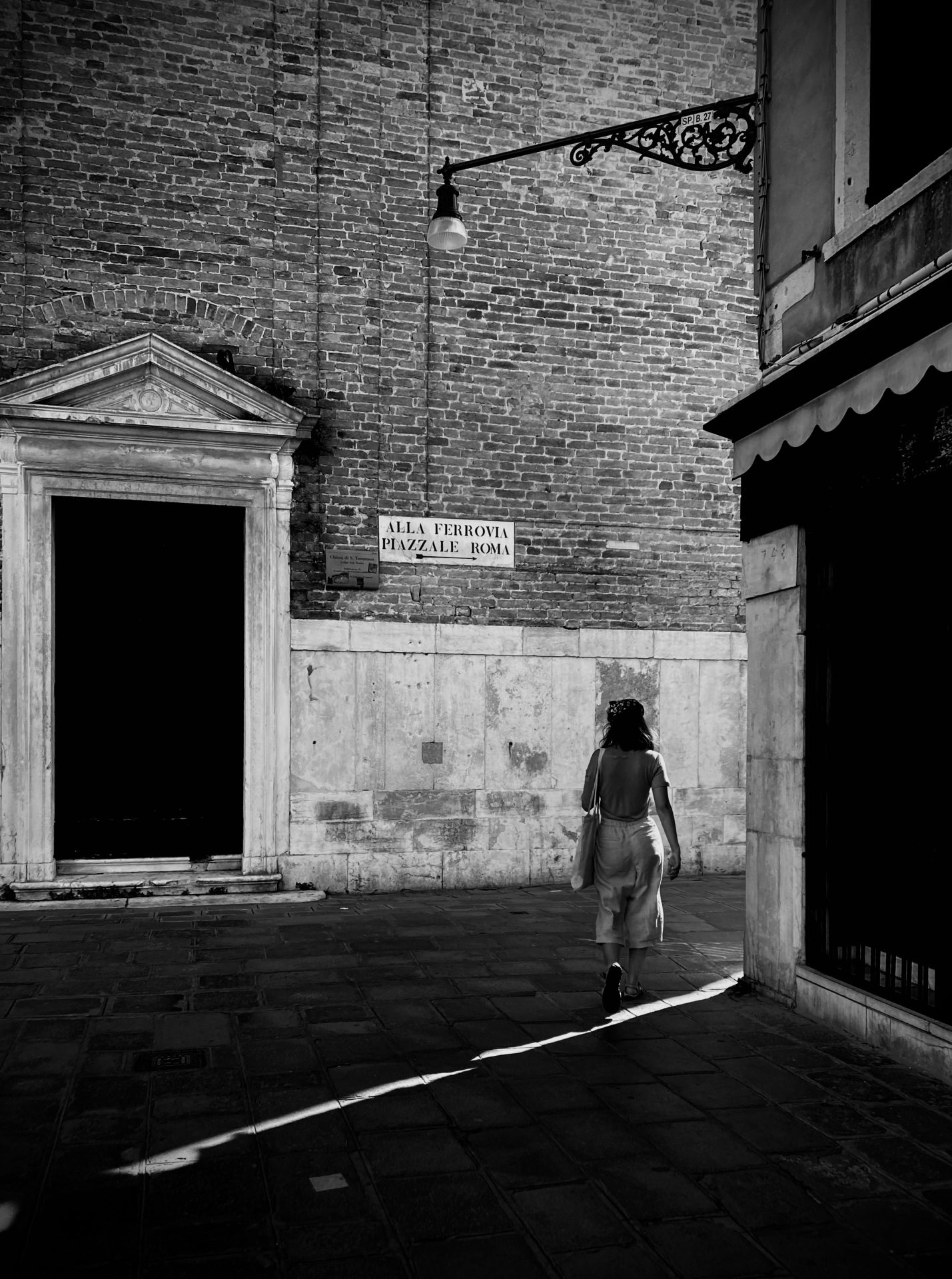
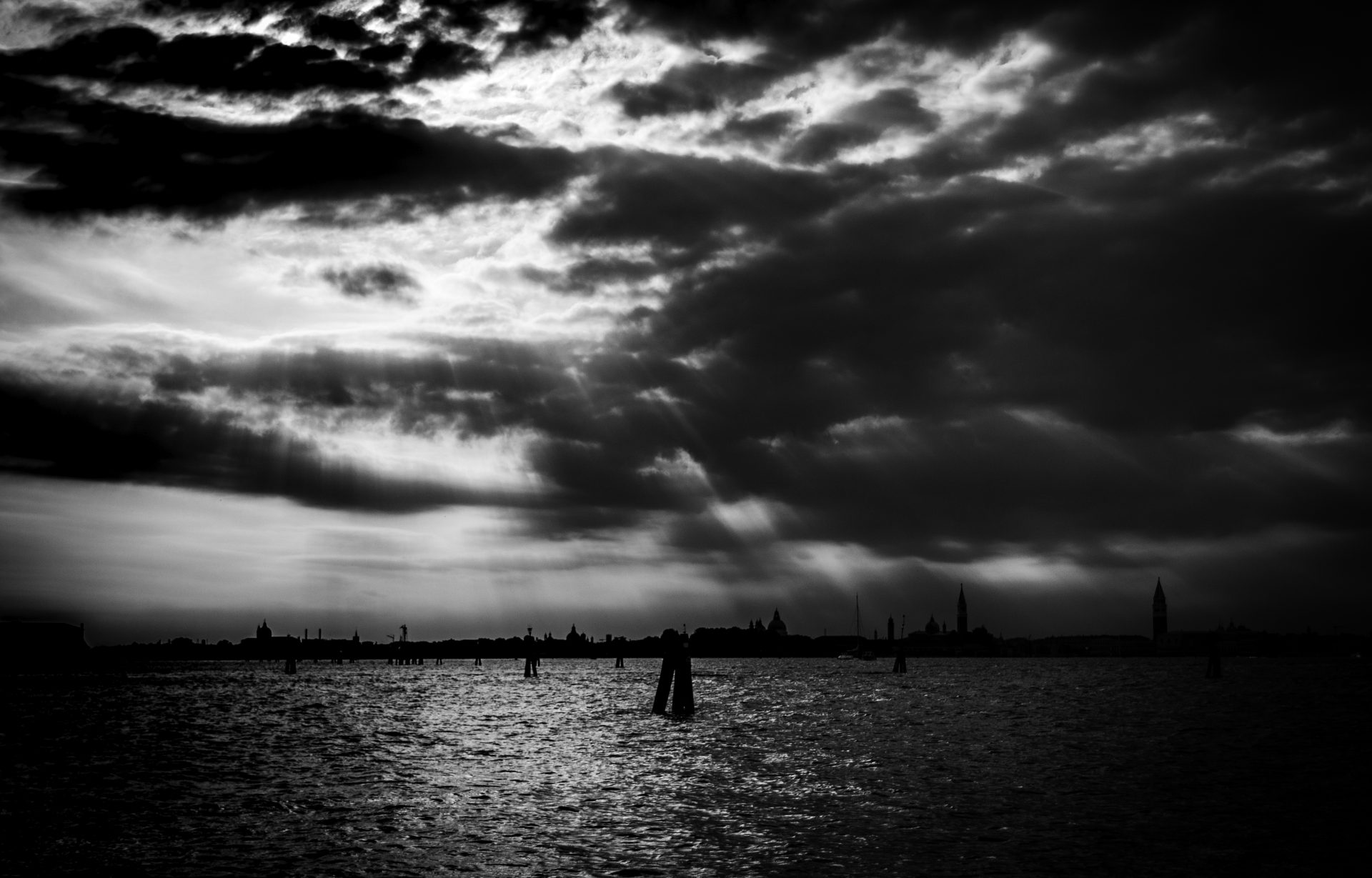 Venezia
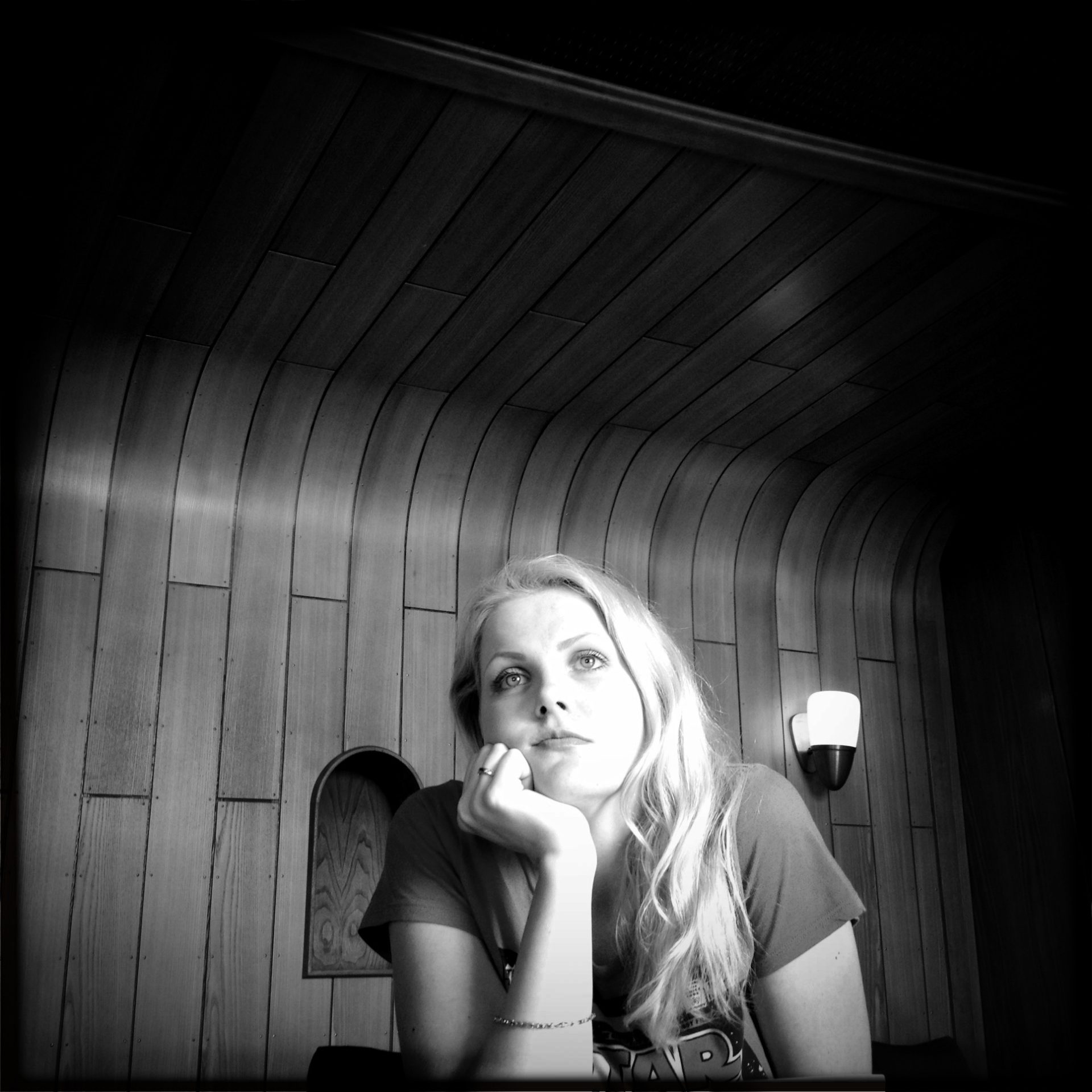
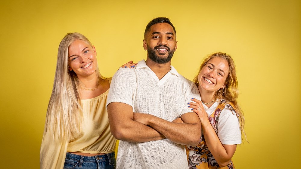
Portraits
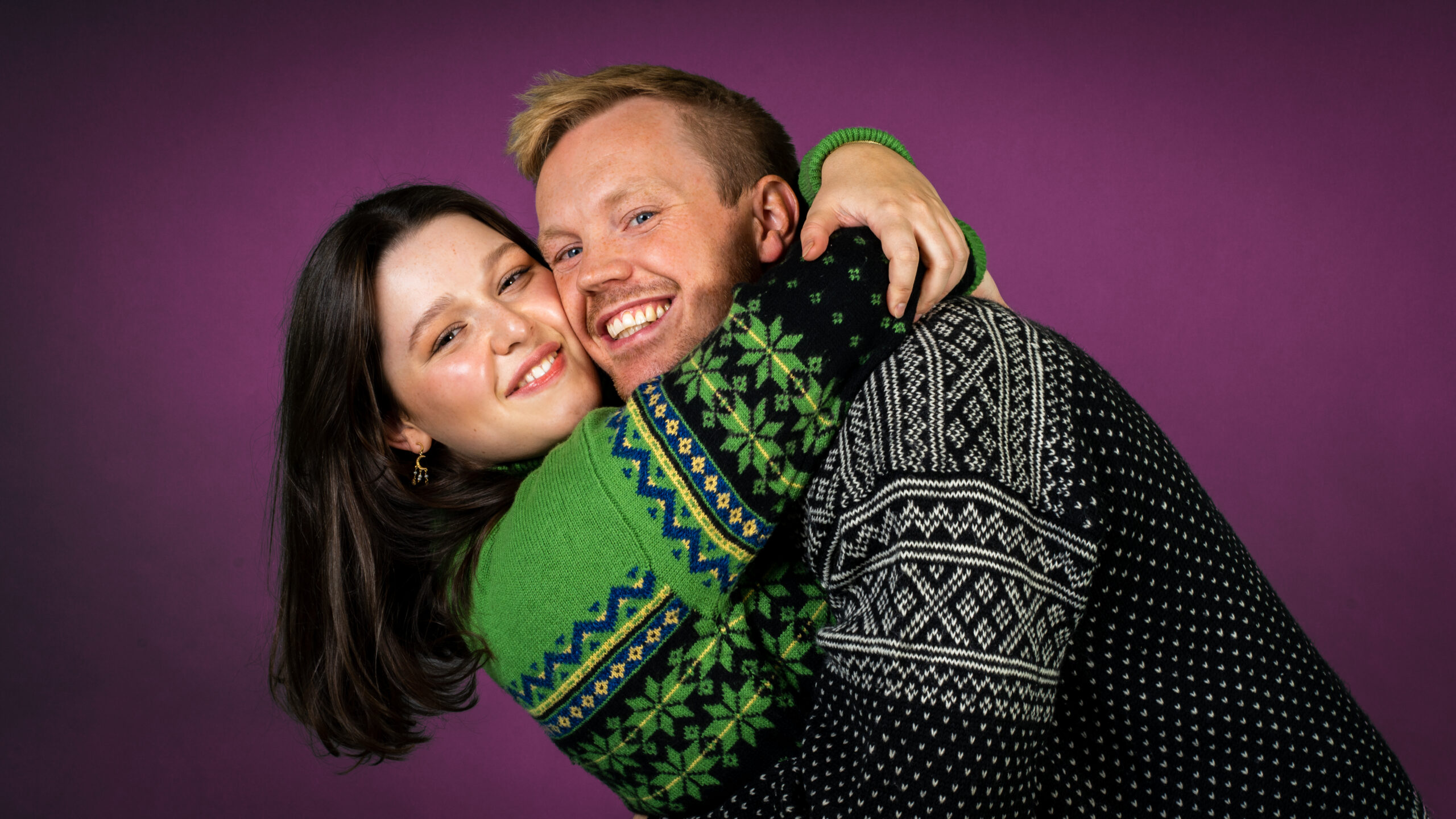 Julia & Martin, NRK mP3
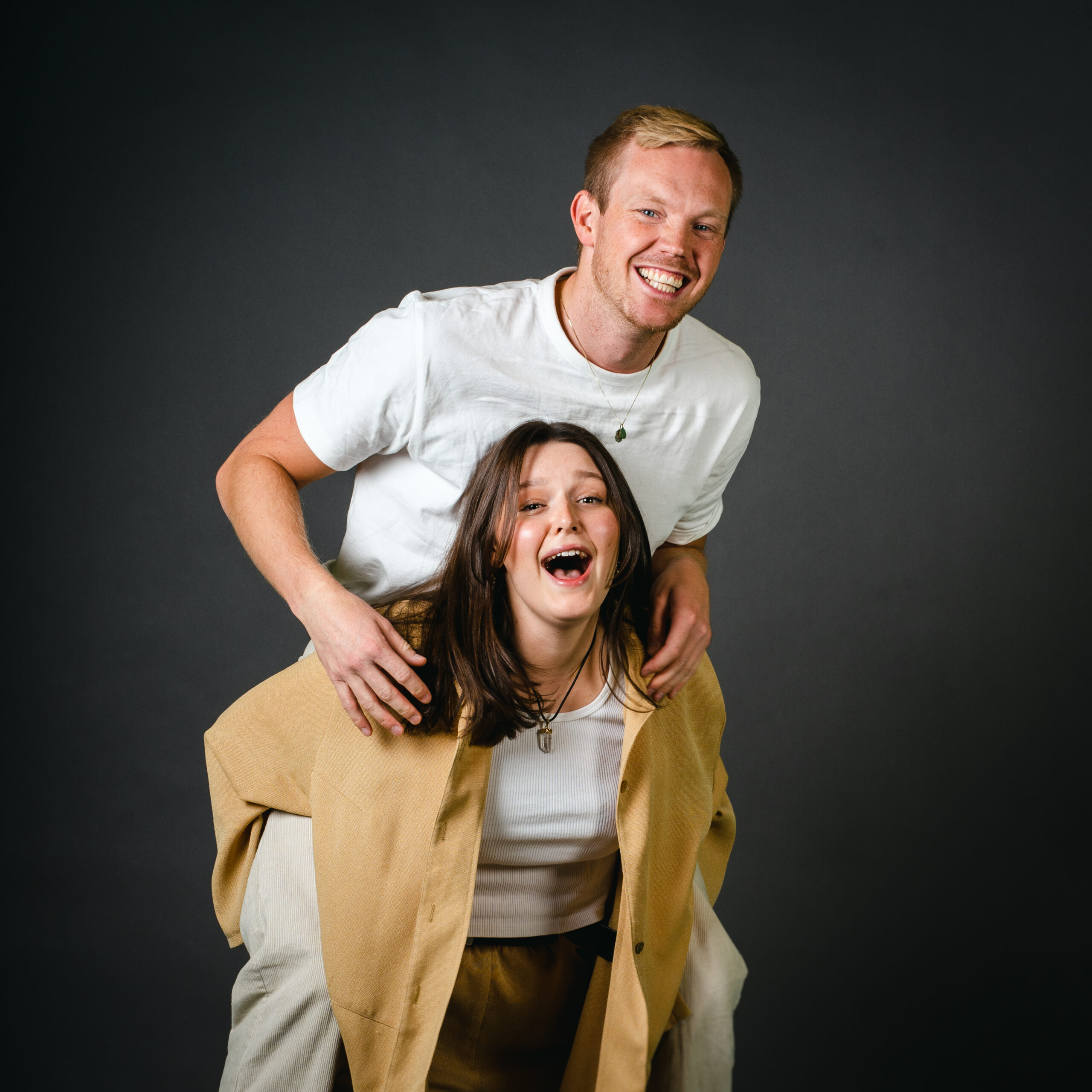 Julia & Martin, NRK mP3
Julia & Martin, NRK mP3
Julia & Martin, NRK mP3
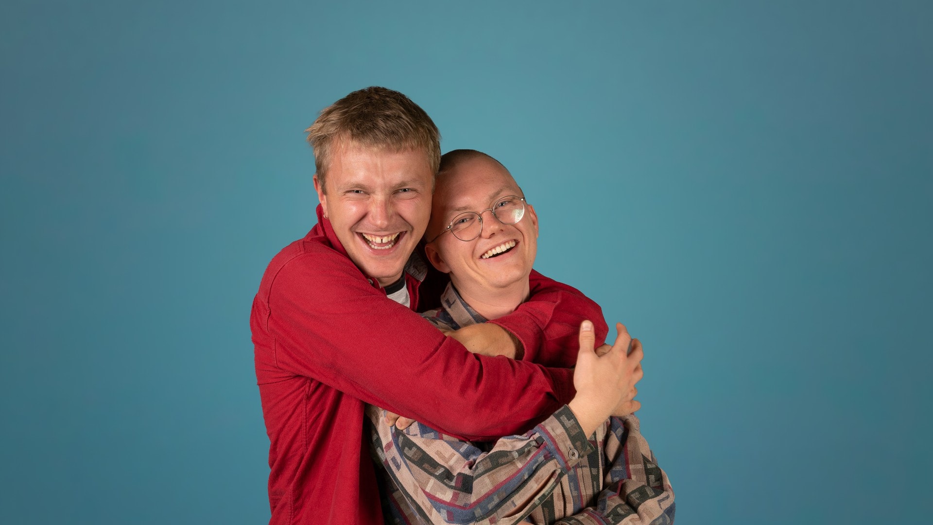 Jon og Andreas show, NRK
Tamanna Agnihotri, NRK
 P3sommer 2022, NRK
Concert
 Karpe, Neonfestivalen 2022, for NRK
 Sondre Justad, Neonfestivalen 2022, for NRK
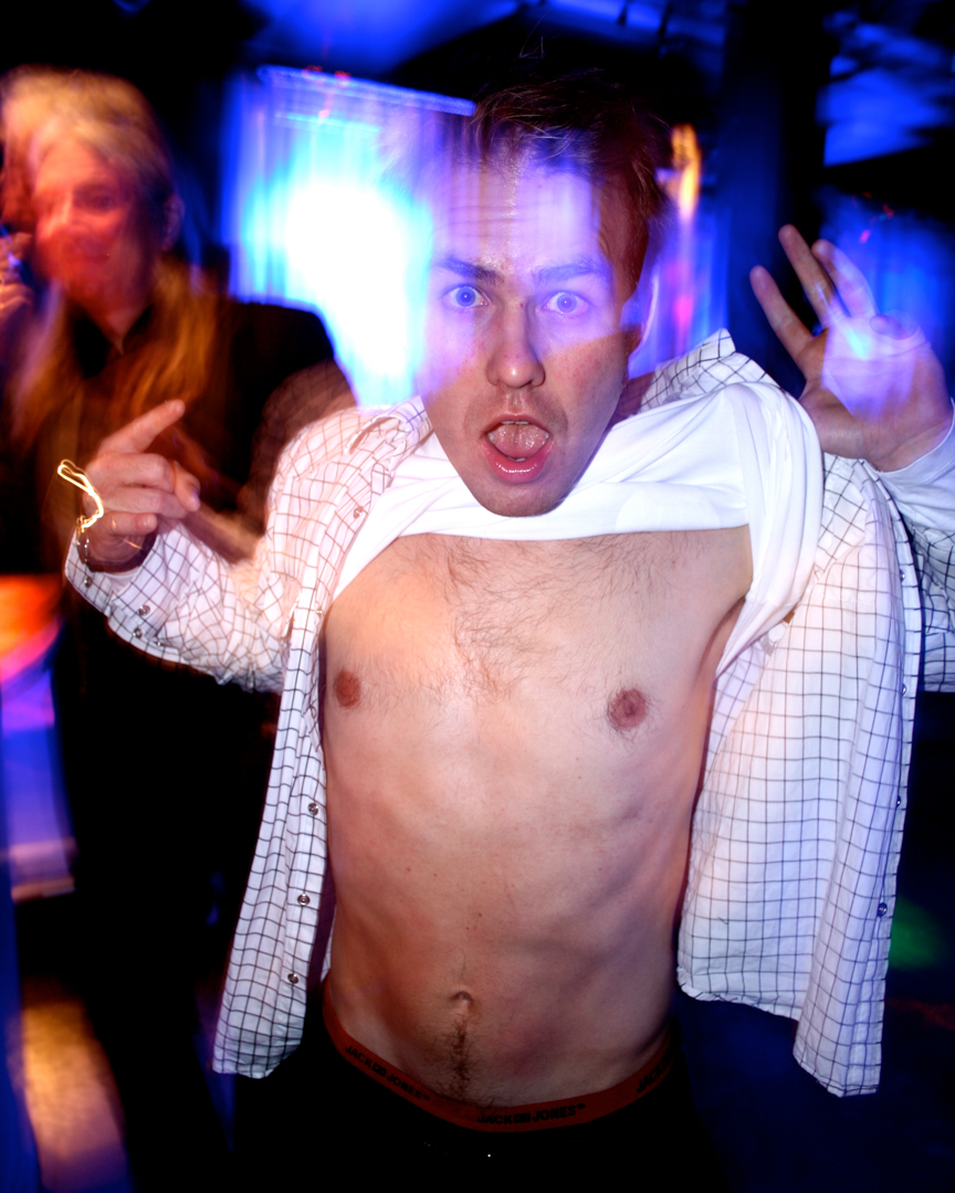
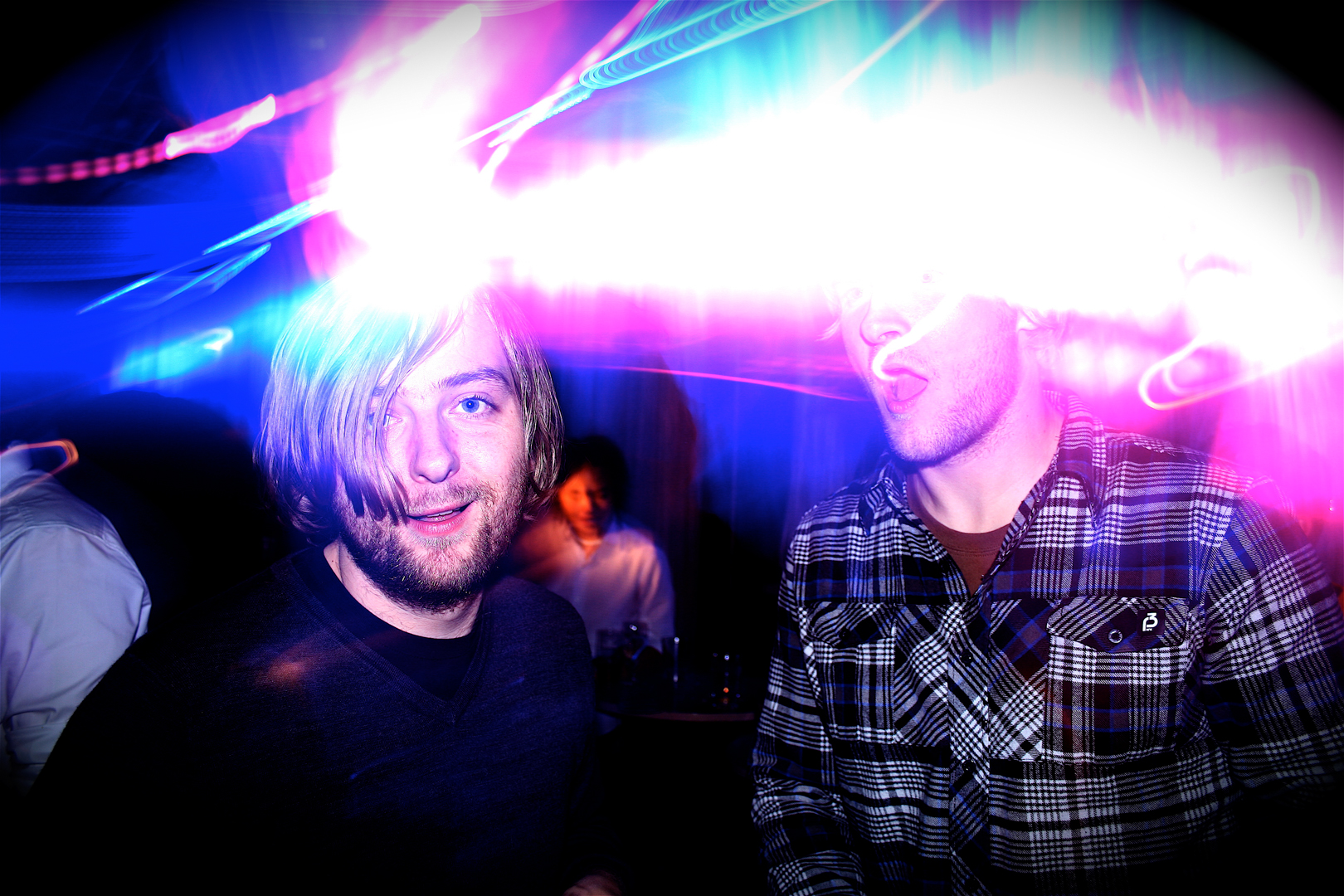
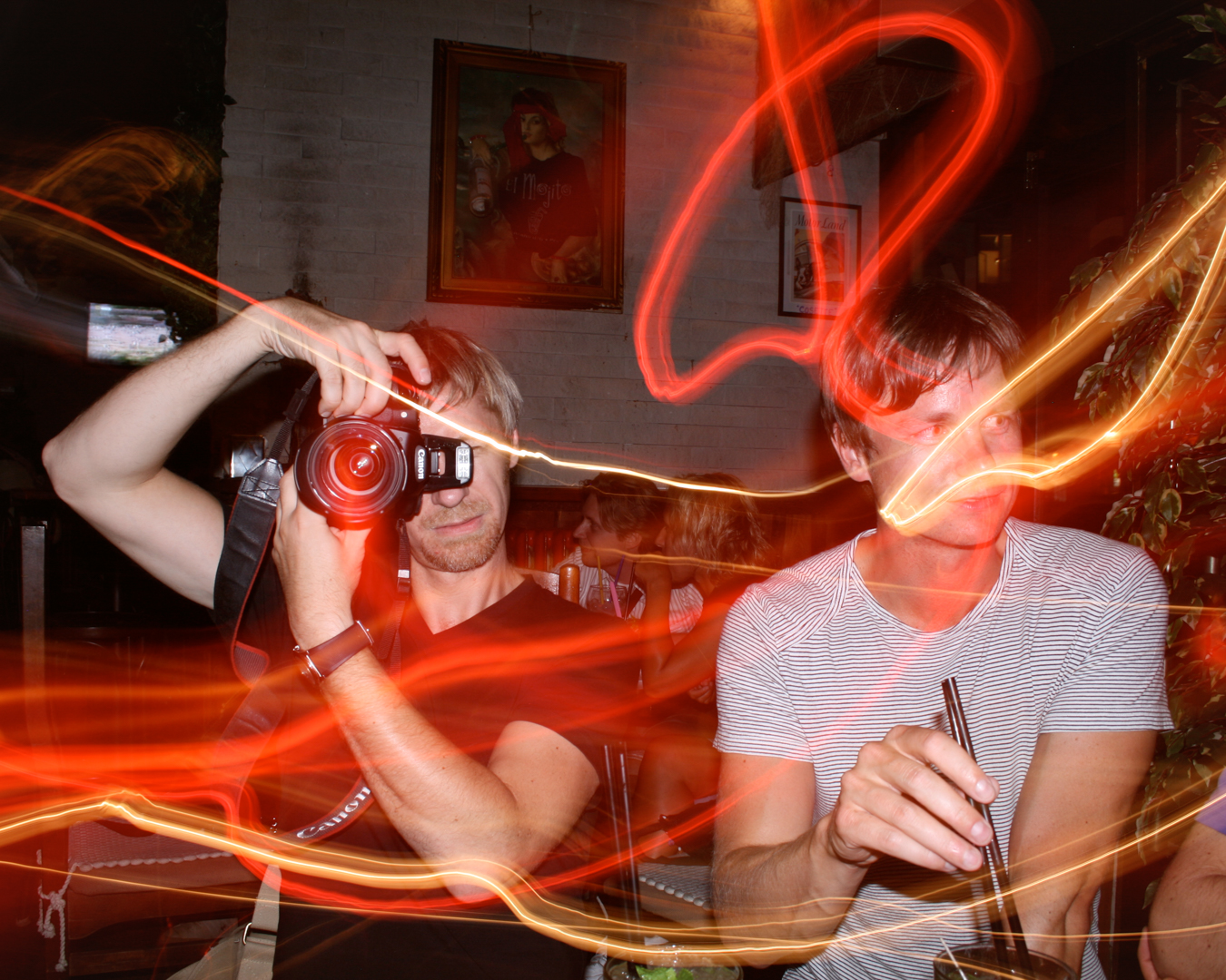
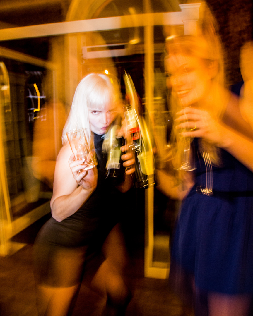
Slow sync flash

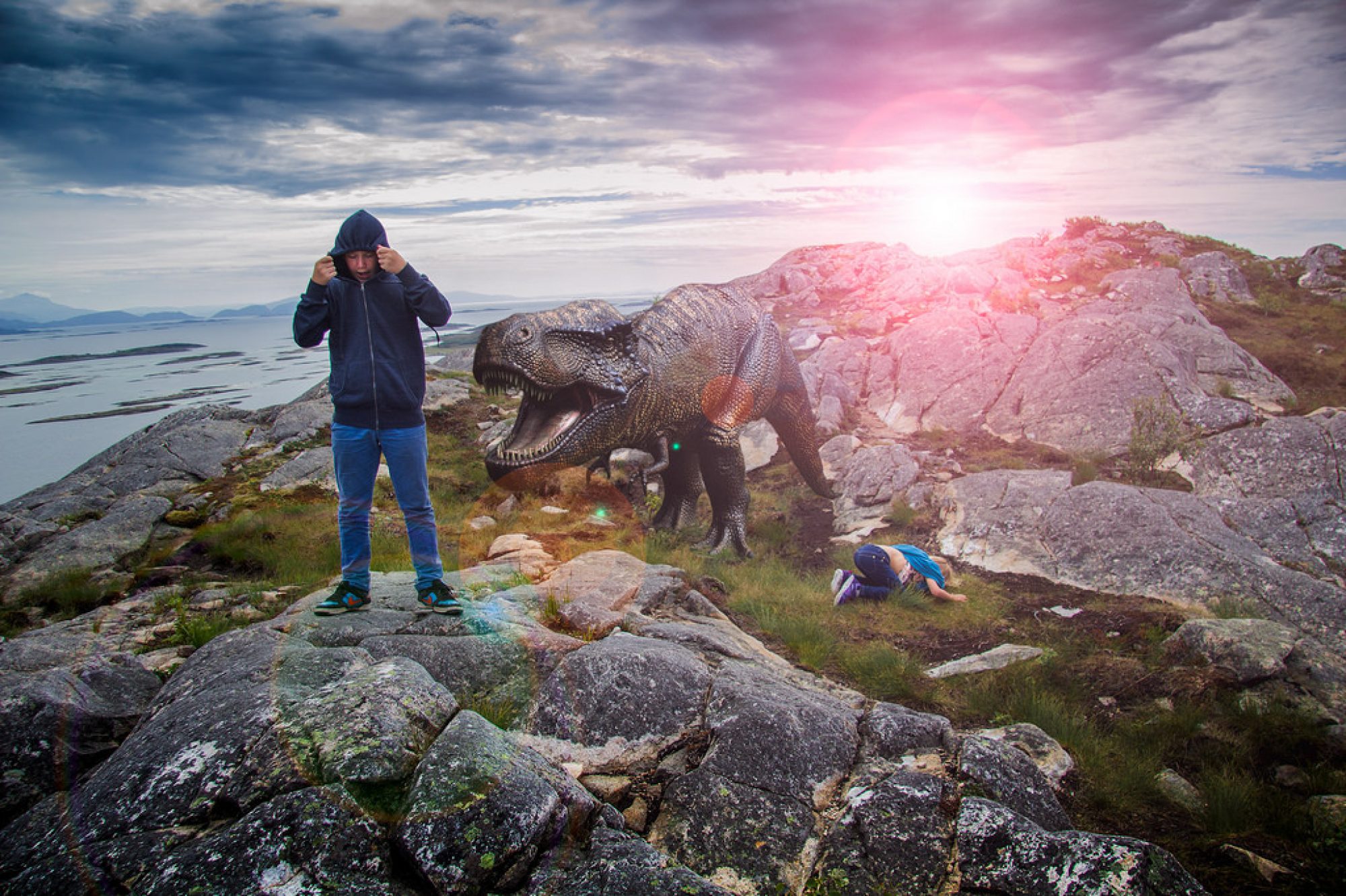
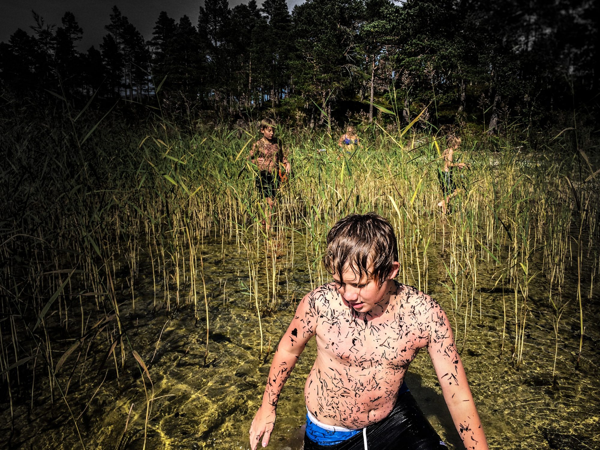
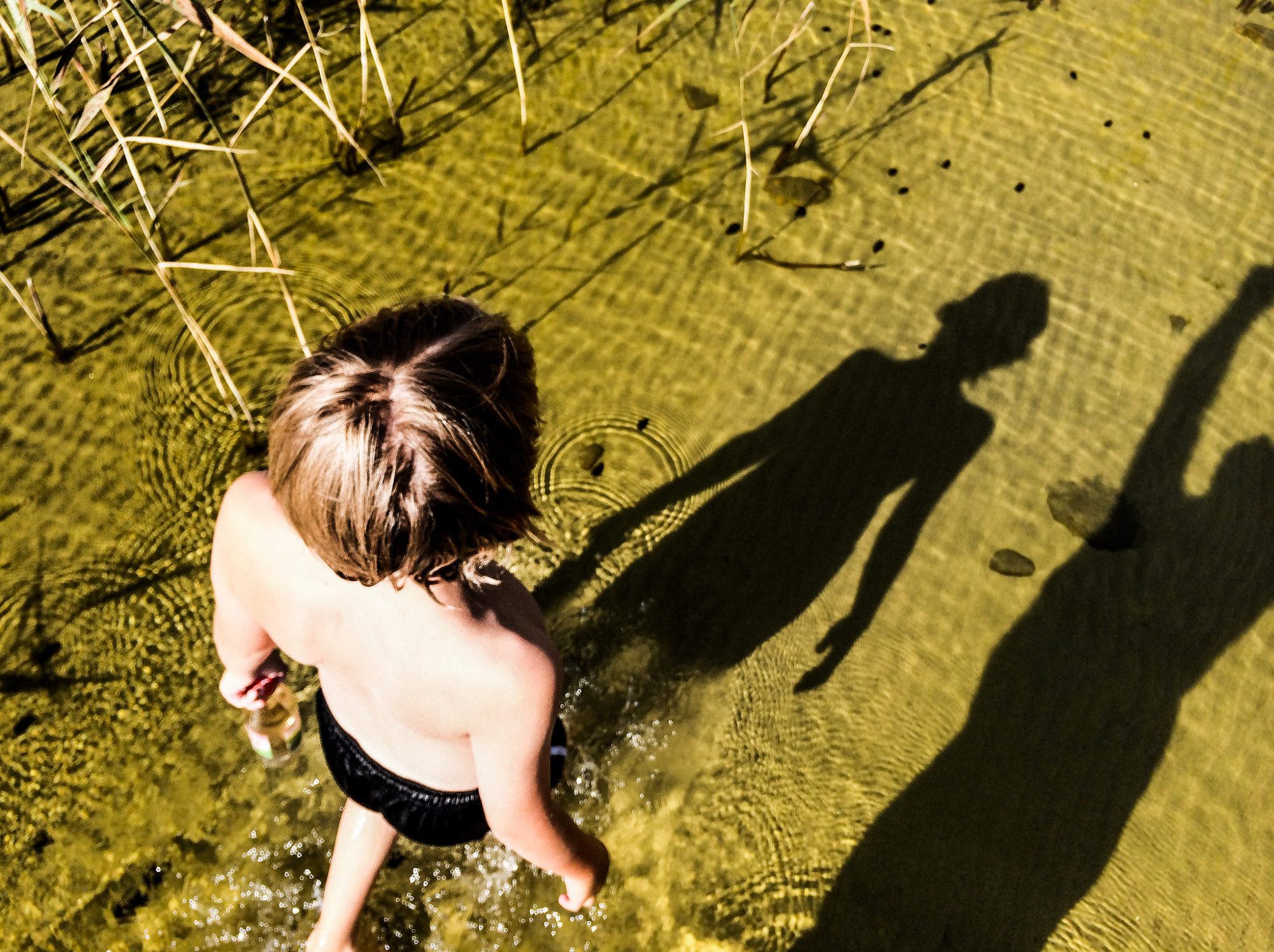
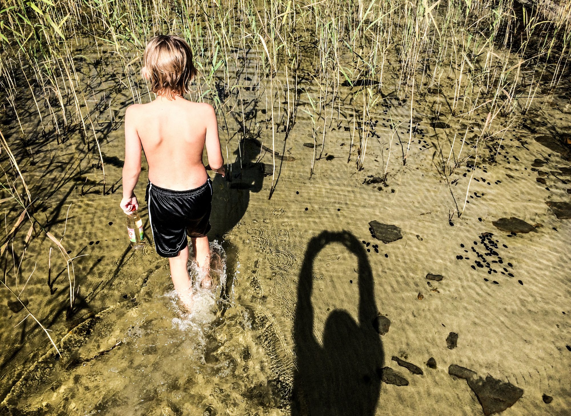
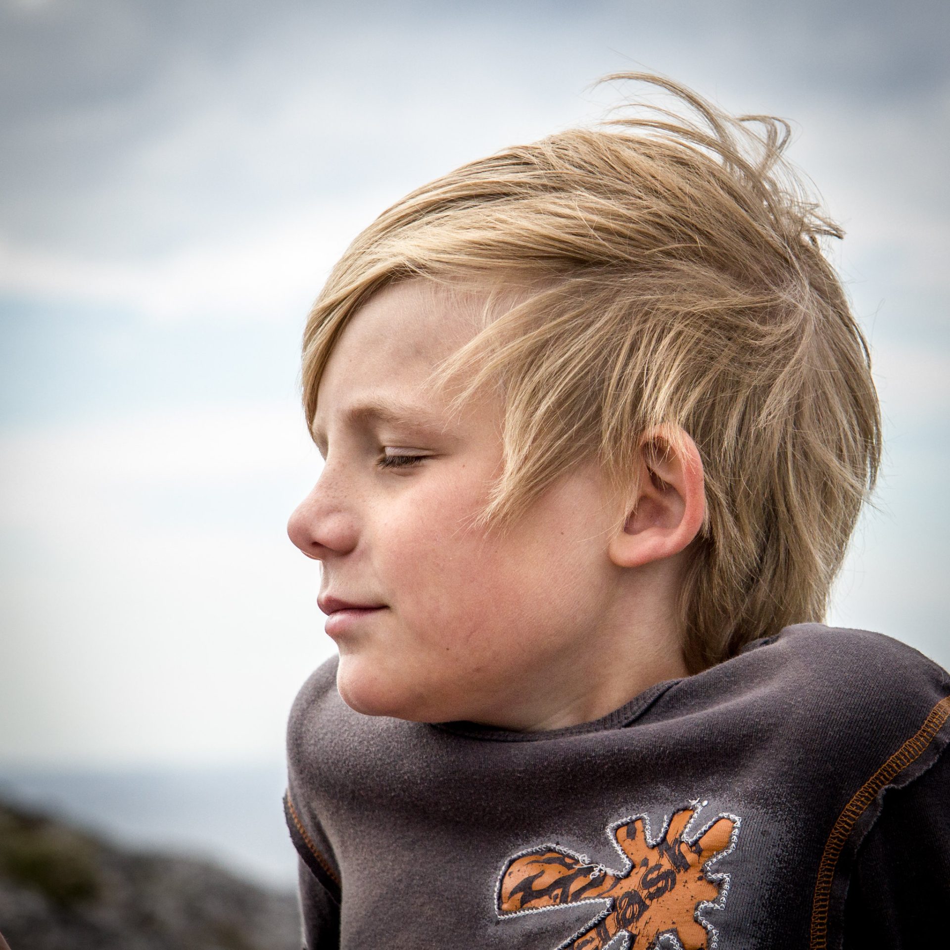
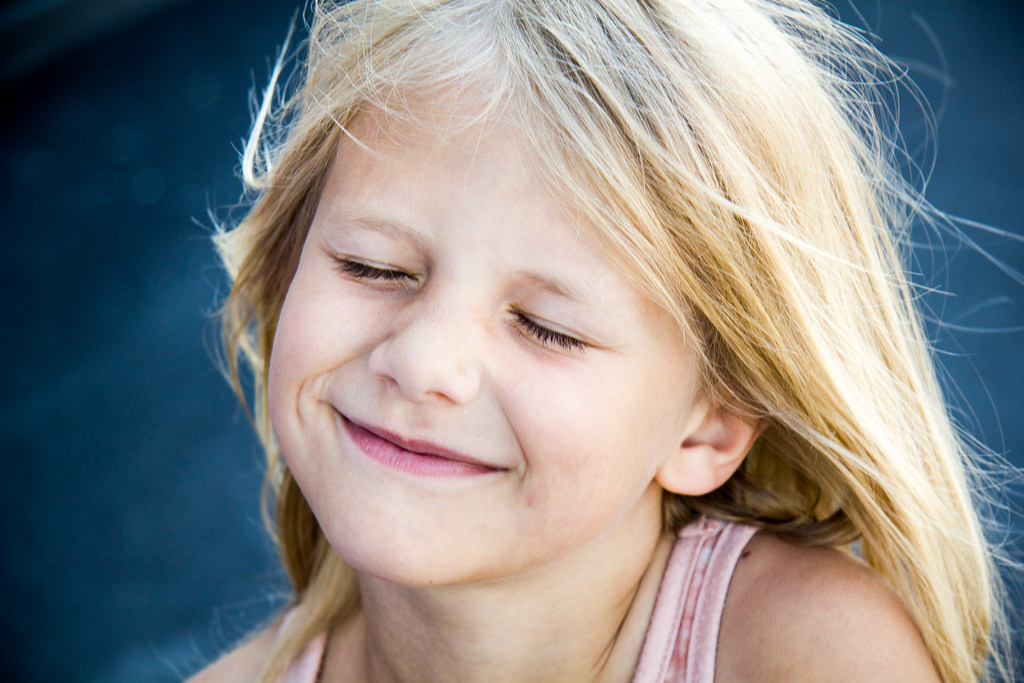
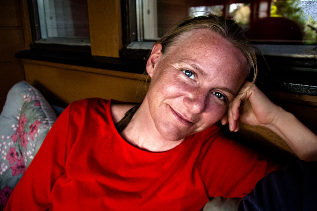
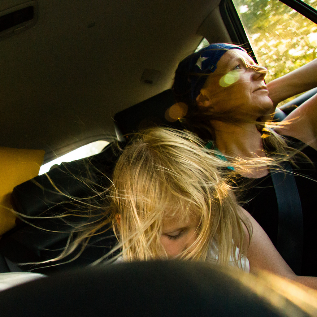
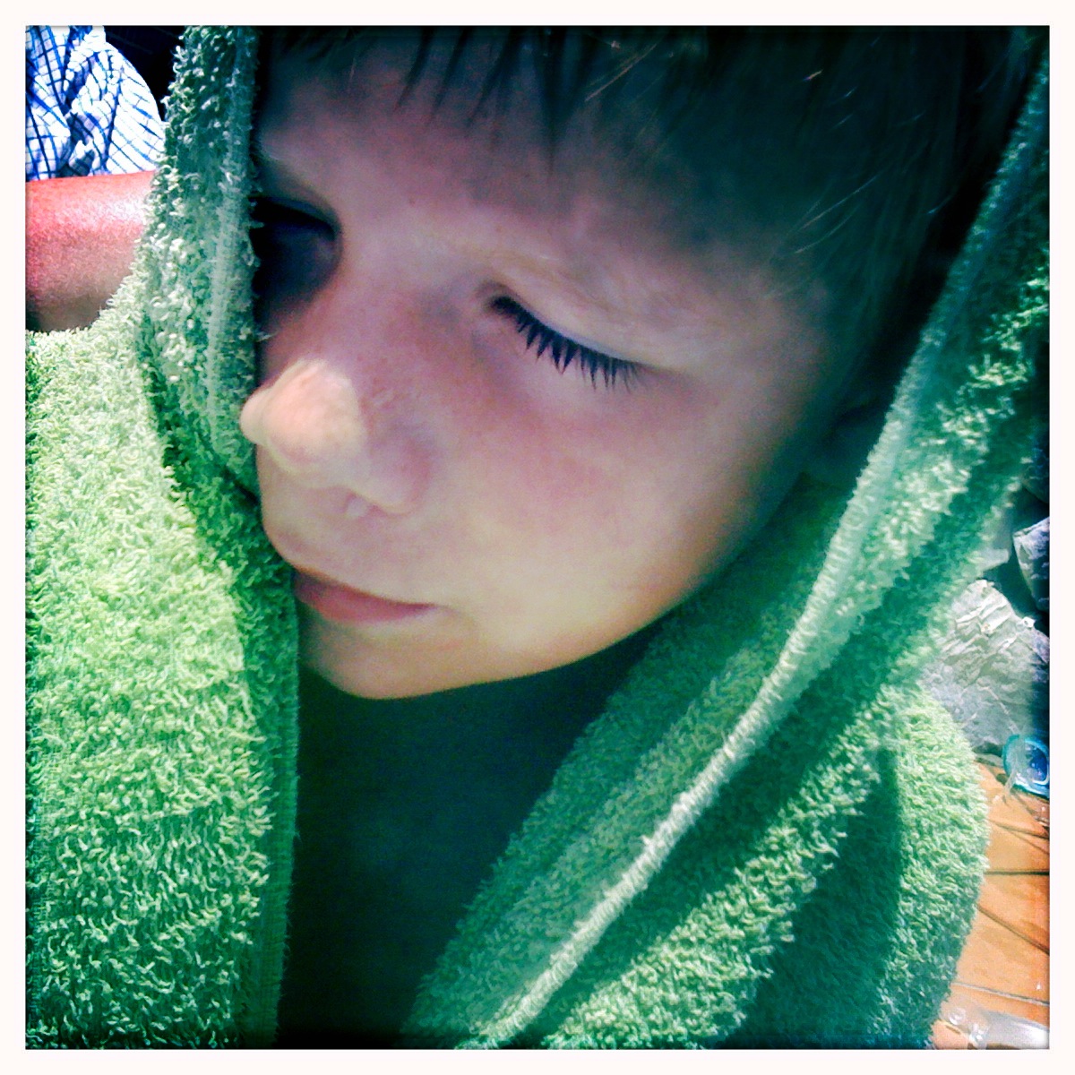
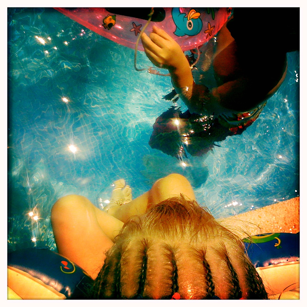
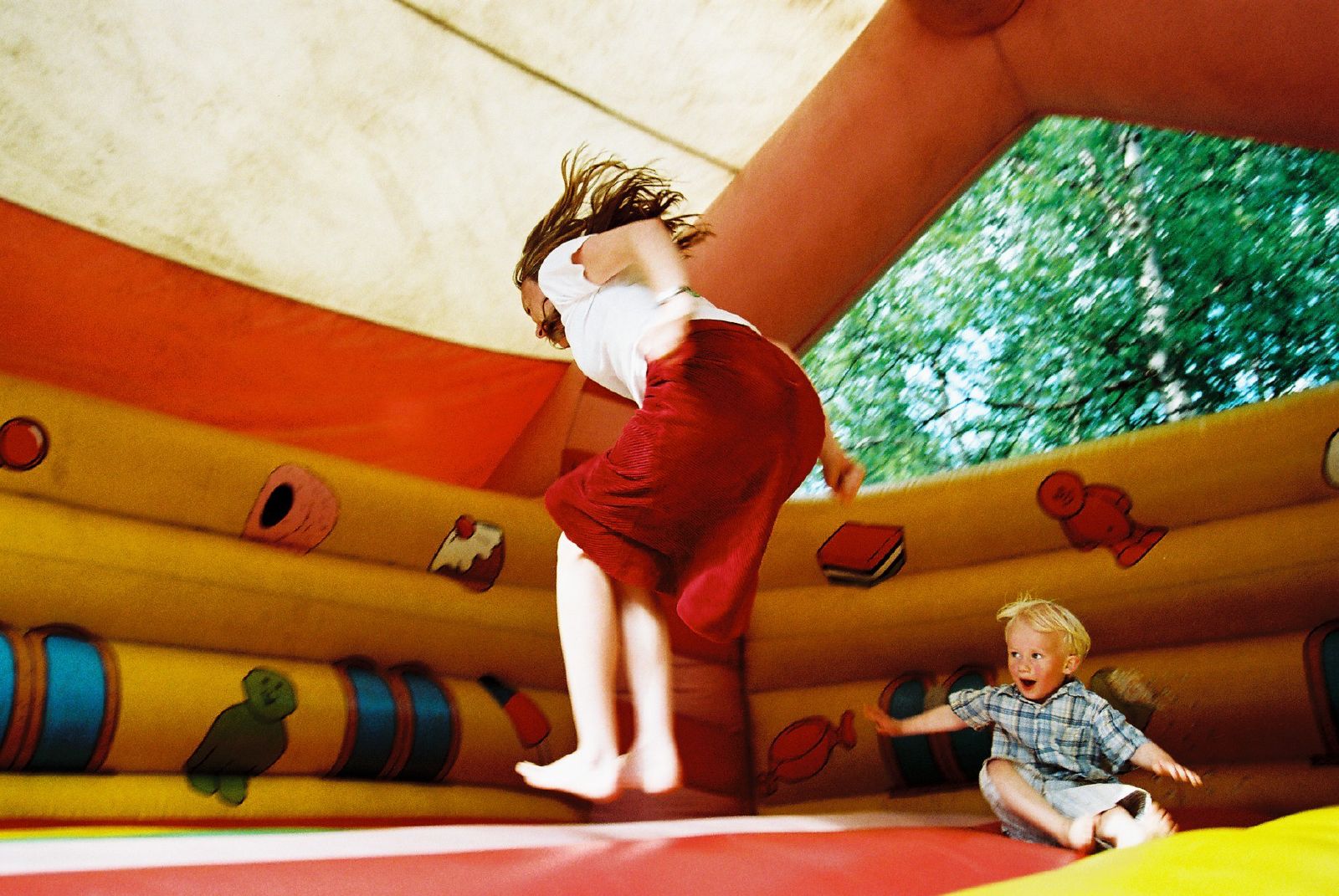
Family
 This is an image caption
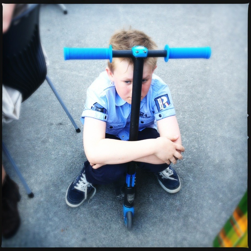
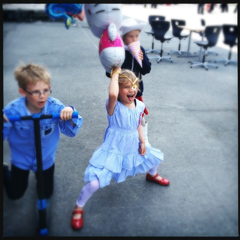
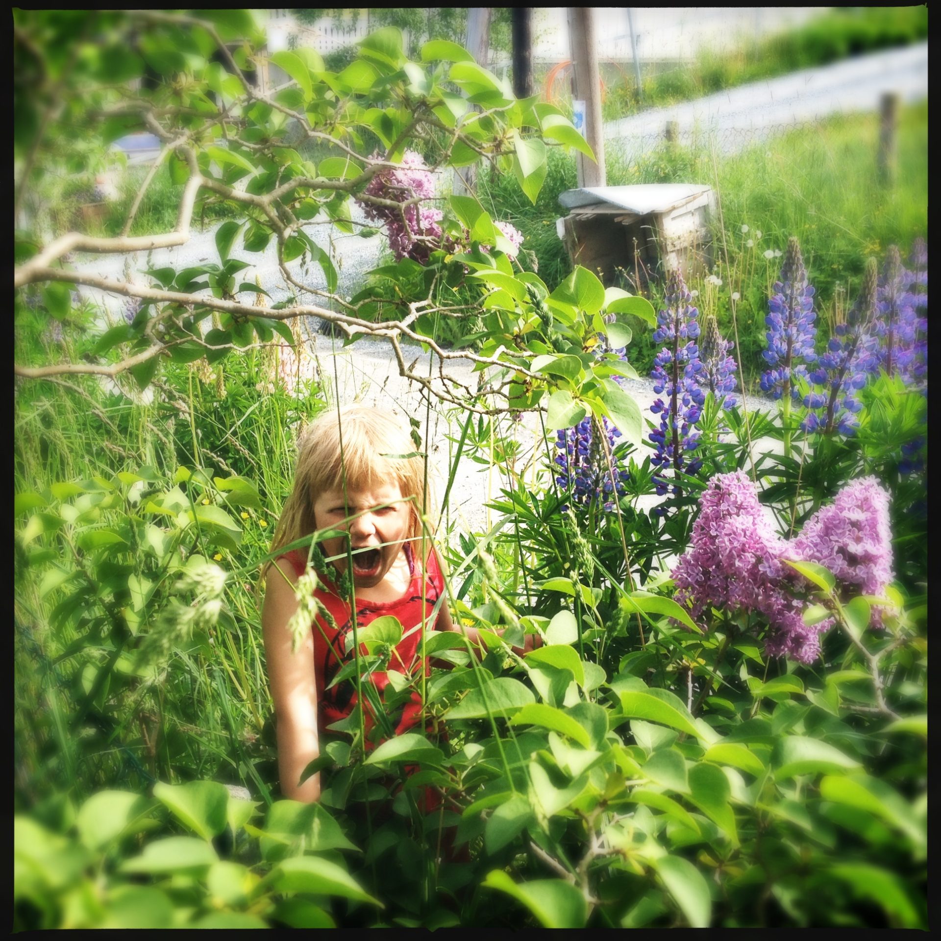 Tyger tyger!
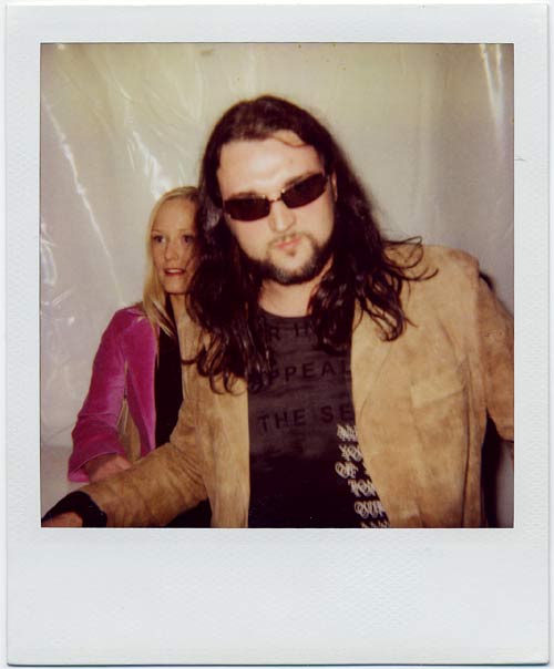
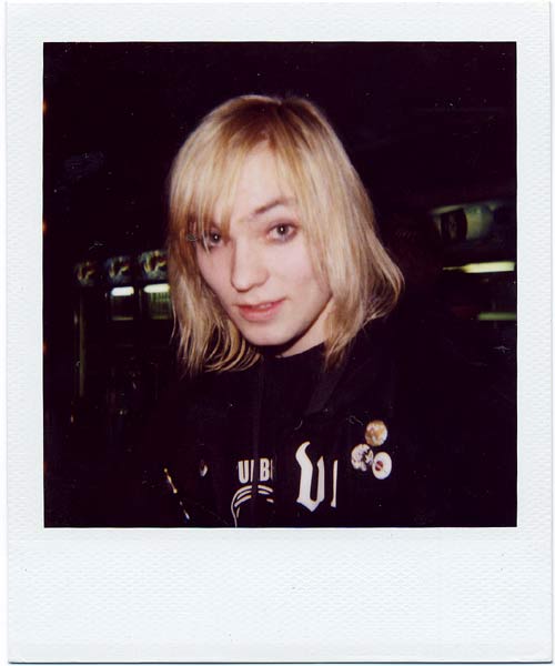
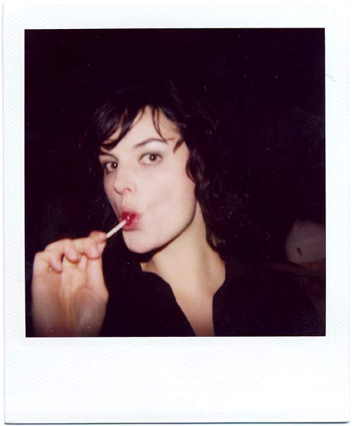
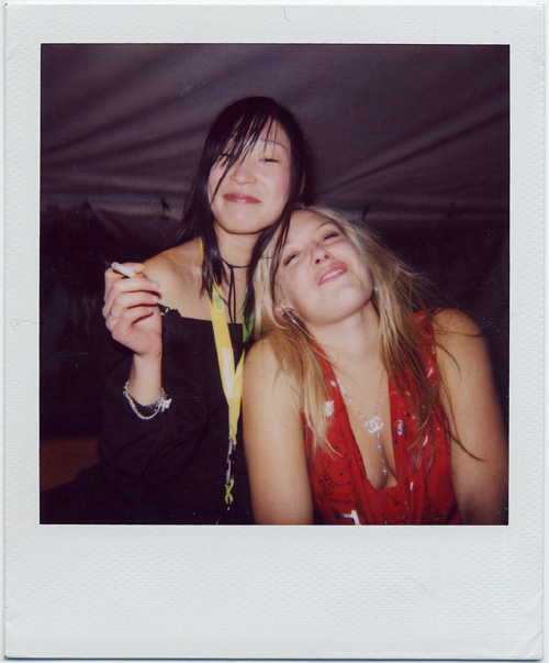
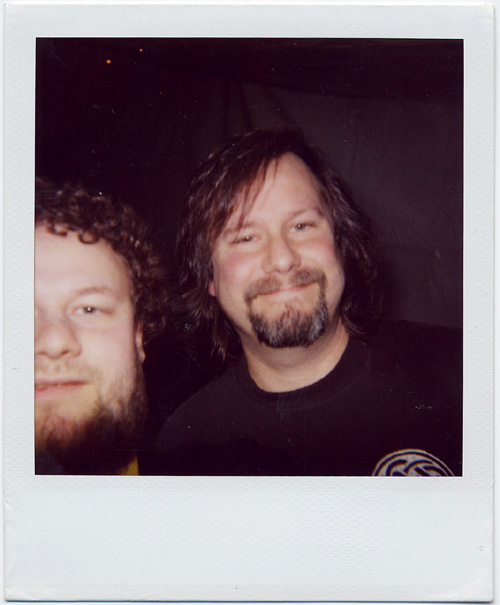
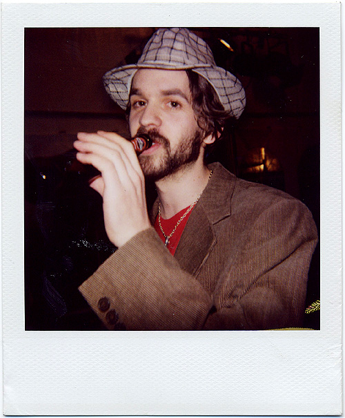
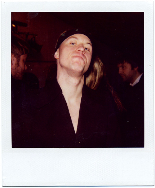
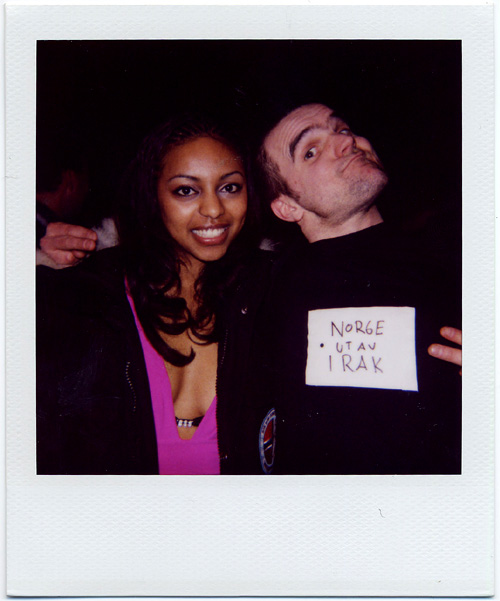
Polaroids, 2005
 Hank Von Helvete
 Ivar Nikolaisen (Silver)
 Karin Park

 Selfie with Billy Gould, Faith no more :)
 Thomas Dybdahl
 Torgny Amdam, Amulet
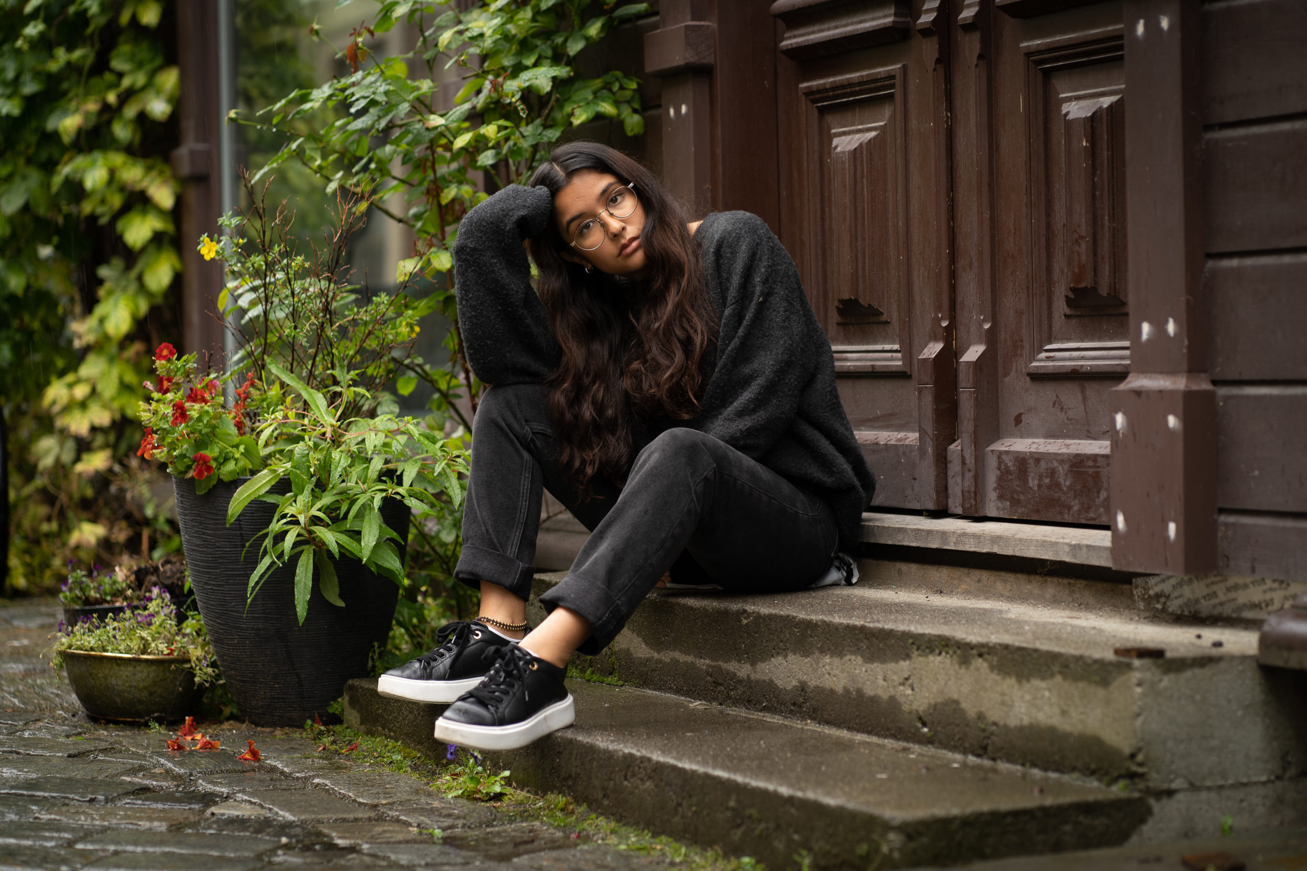
Small things