Hello, my name is Morten, and I’m a TED.com addict. («-Hello Morten»). TED is definitely my favorite source for inspiration and ideas. I’ve spent countless hours watching and listening to all those facinating talks over the years. So what better place to look for inspiration for my new header? The original: Ideas worth spreading I’ve… Fortsett å lese Homage to TED.com
Stikkord: design
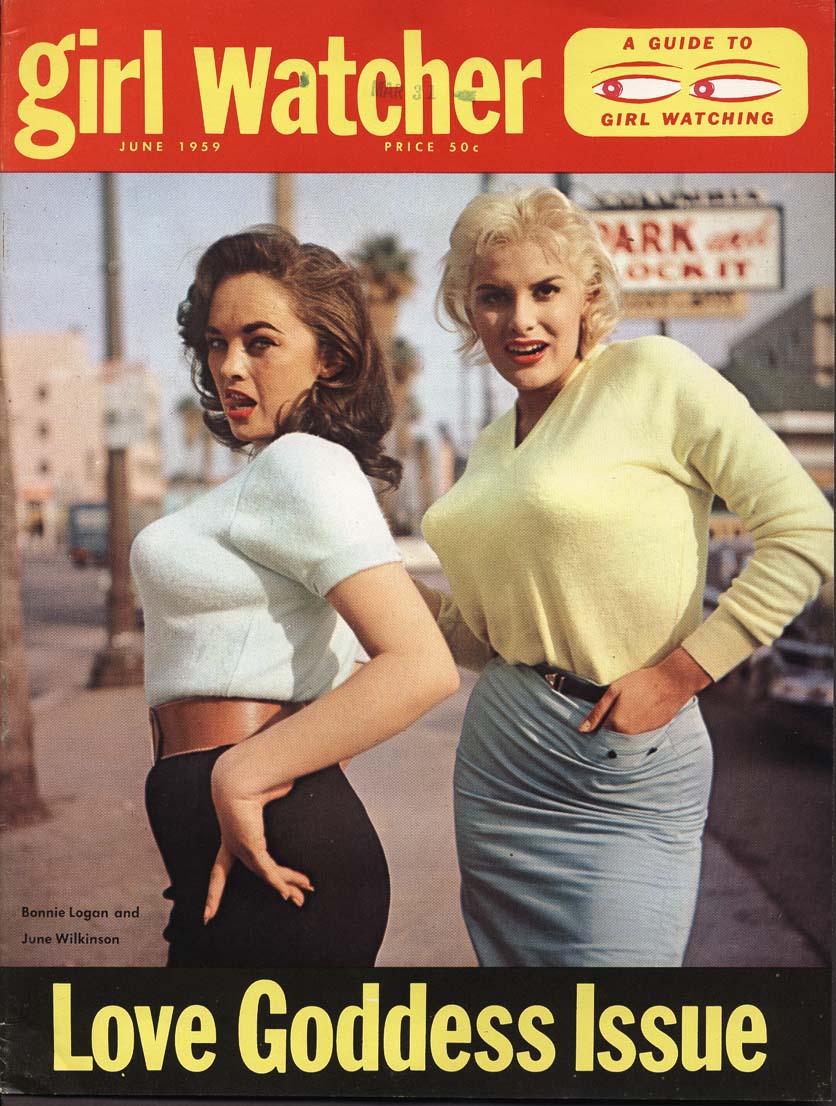
A Guide to Girl Watching
June 1959 Issue of The Girl Watcher.
Open source design – Vector Apple vs Pear logo
The Apple Logo is just so 1990’s. Time to go pear-shaped with this spoof logo.
Vintage cars
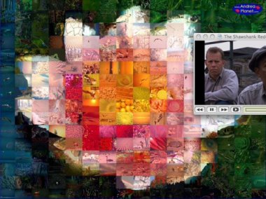
AndreaMosaic
AndreaMosaic Home Page With this freeware program you can create your own photomosaics made with your own pictures. A photo-mosaic is a mosaic where every tile is a photograph and not just a simple colored piece.
Can you have too much ease-of-use?
Photo: Snooze, from Flickr (CC) Stipping things down to the bare minimum is Apples mantra. But isn’t easy equal to boring? Excerpt from an interesting article on the subject: Think about it… skiing, dancing, chess, photography, flying, dressage, gardening, dog training, environmental activism, religion… when people are into any of those things passionately (as opposed… Fortsett å lese Can you have too much ease-of-use?

